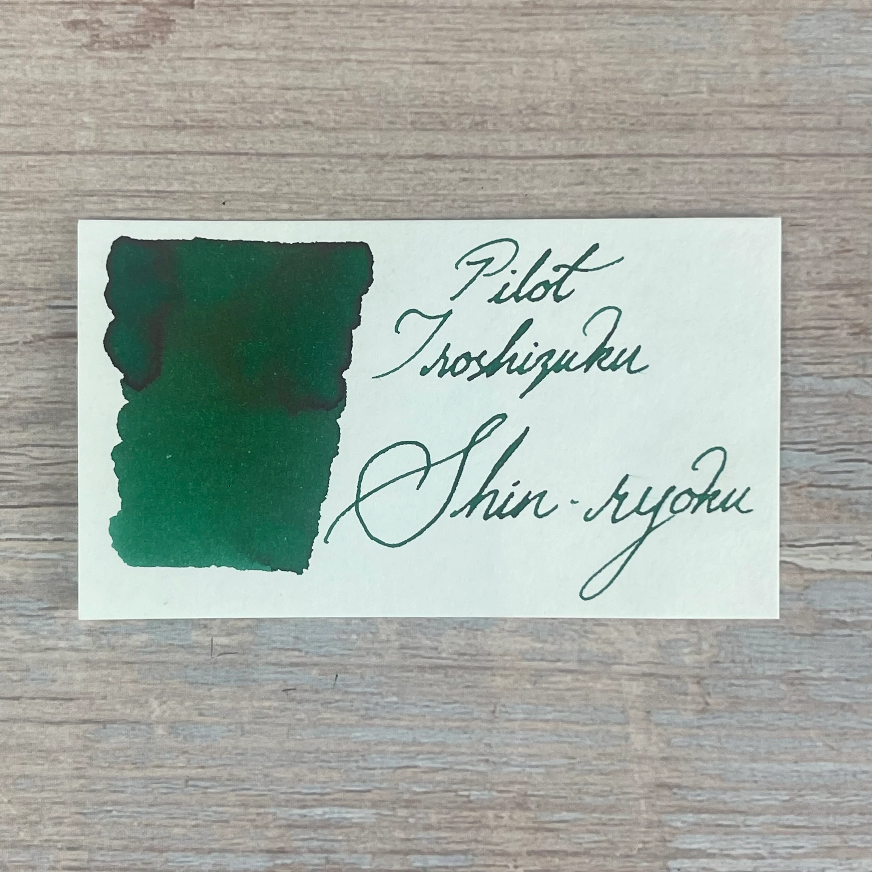
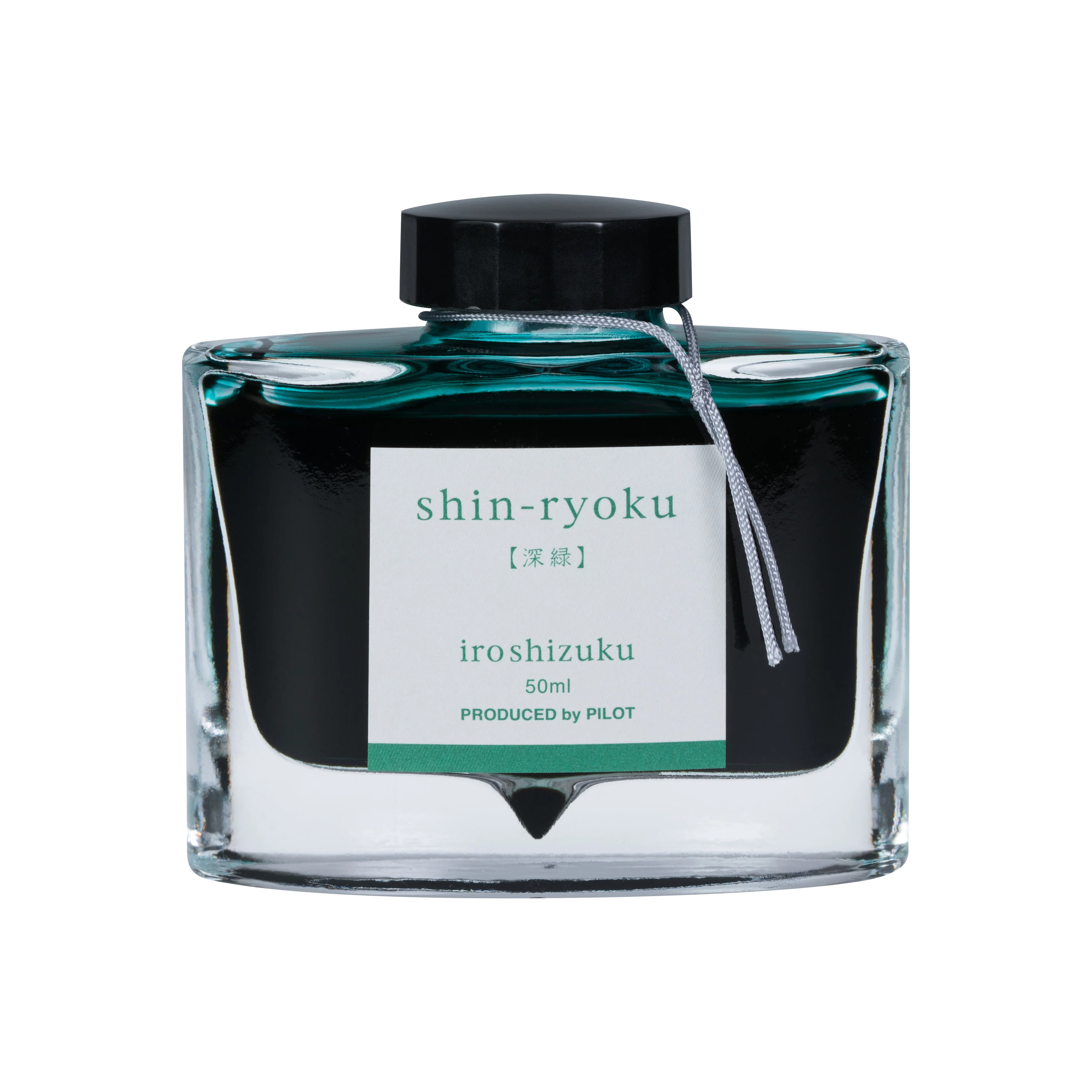
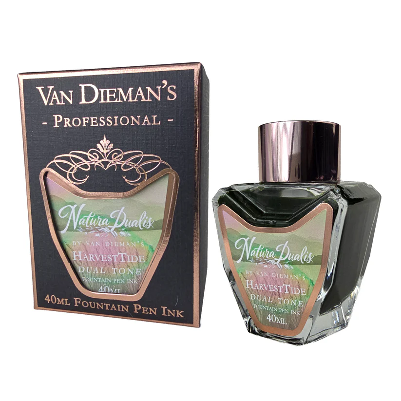
Van Dieman's Professional - Natura Dualis - Harvest Tide - 40ml Bottled Ink
The Natura Dualis collection by Van Dieman’s brings together moments in nature where contrast and harmony coexist. Each ink is formulated not only for visual beauty, but for movement — dual and multi-shading behaviour, halos, colour splits, and rivering that reflect the changing character of the natural world. Like dawn breaking over land, or water surging beneath stillness, these inks never show just one face.
HarvestTide brings this vision down to earth. It captures the precise moment where summer begins to tip into autumn — when the wheat is tall and gold, but the light has softened and the air carries the first cool current of change. If Daybreak and Nightfall are skybound, HarvestTide is rooted in the land — in grain, soil, and seasons turning.
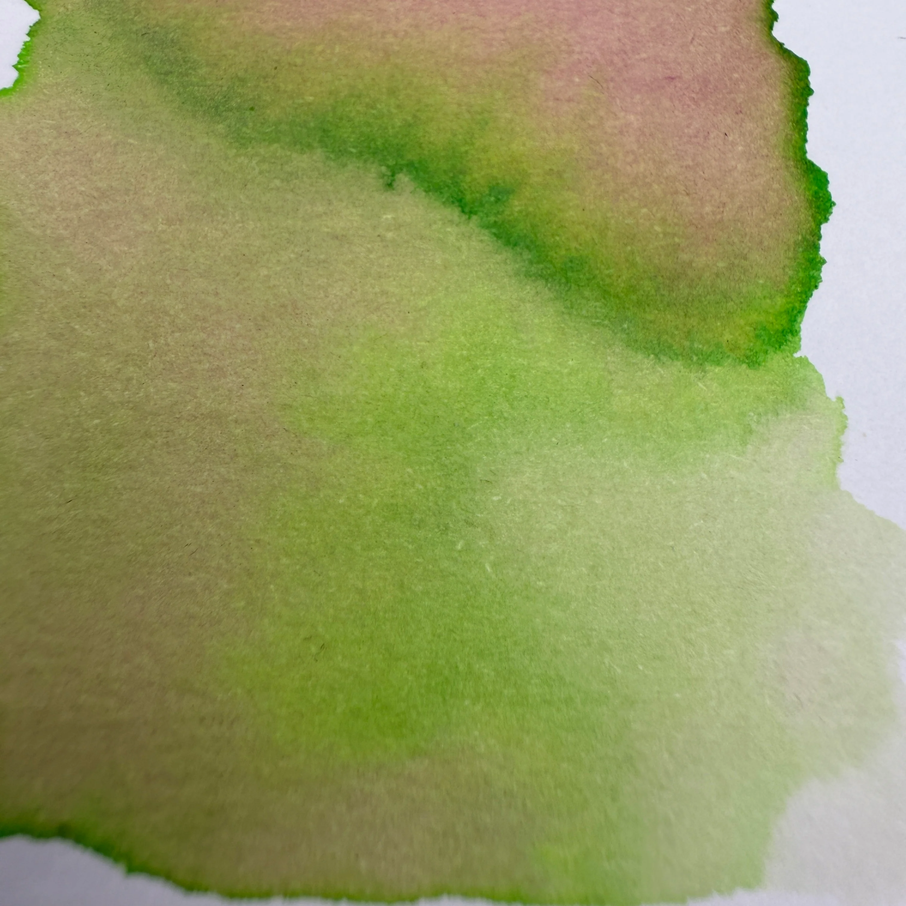
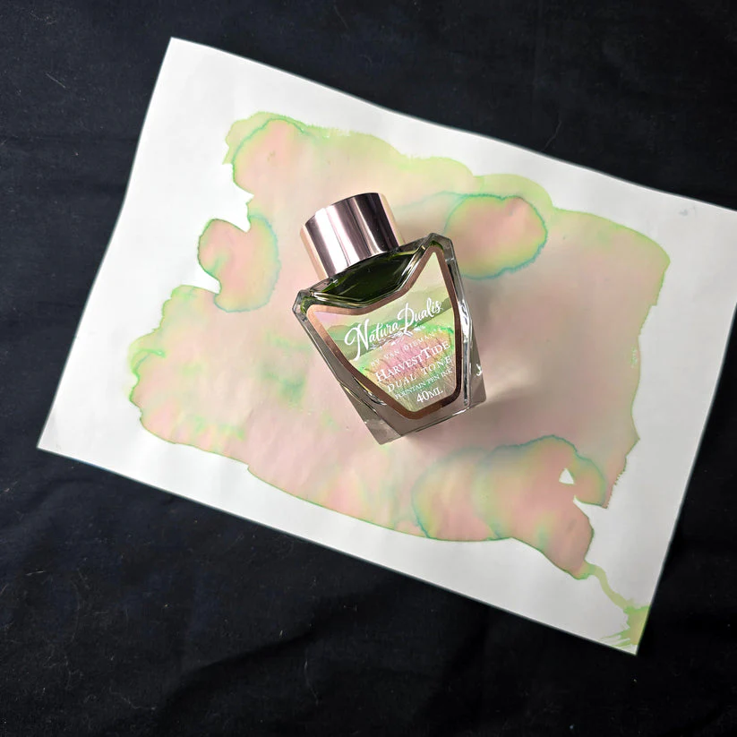
The colour is soft but richly complex. A mellow golden base gives way to cool green halos and hints of rosy warmth in areas of ink pooling. The shading is subtle but unmistakable — layers of warmth and coolness, ripeness and rest, all in one. On Tomoe River and other high-performing papers, expect dramatic multi-tonal flow; in regular writing, a warm, organic variation that settles into something timeless.
Original: $23.00
-70%$23.00
$6.90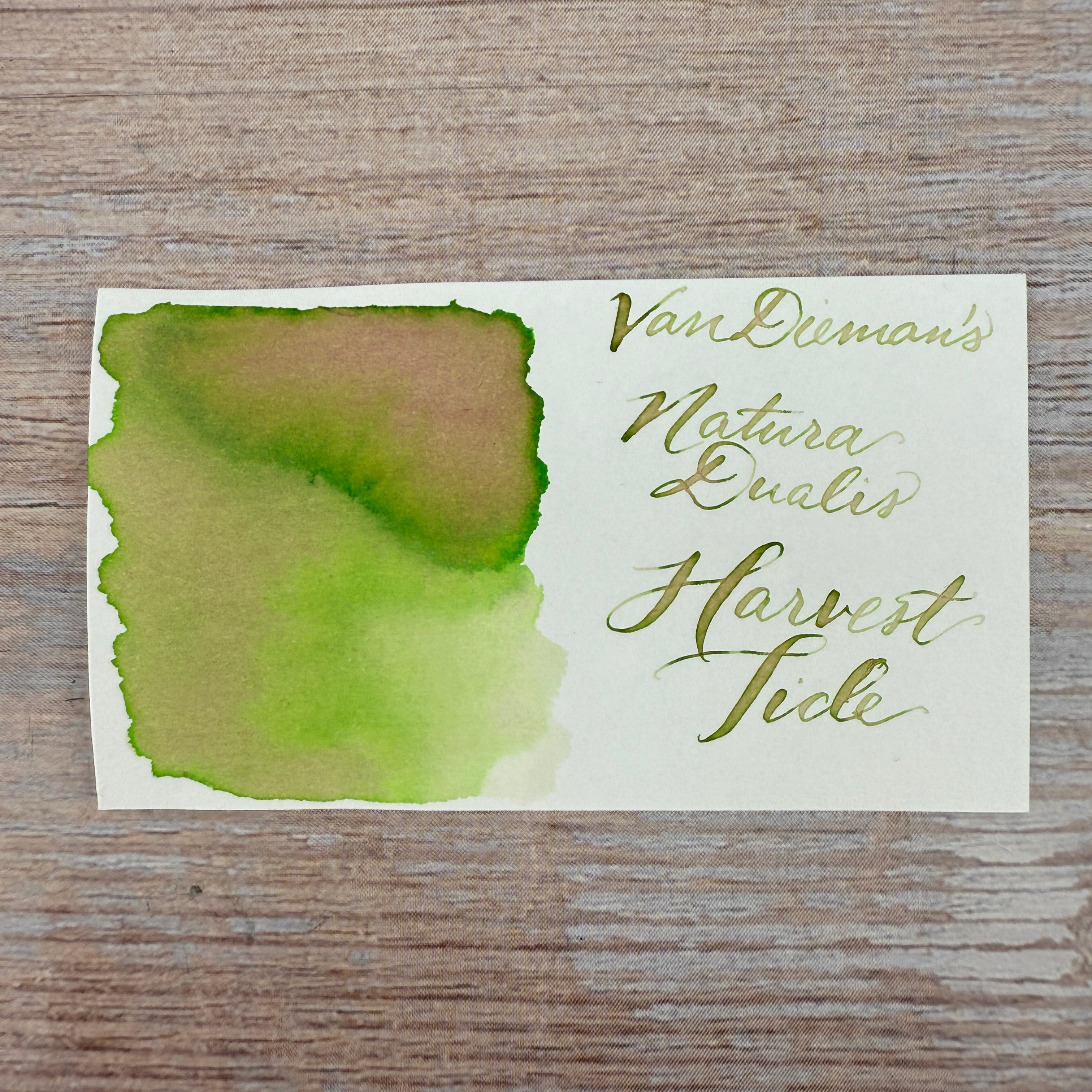
Description
The Natura Dualis collection by Van Dieman’s brings together moments in nature where contrast and harmony coexist. Each ink is formulated not only for visual beauty, but for movement — dual and multi-shading behaviour, halos, colour splits, and rivering that reflect the changing character of the natural world. Like dawn breaking over land, or water surging beneath stillness, these inks never show just one face.
HarvestTide brings this vision down to earth. It captures the precise moment where summer begins to tip into autumn — when the wheat is tall and gold, but the light has softened and the air carries the first cool current of change. If Daybreak and Nightfall are skybound, HarvestTide is rooted in the land — in grain, soil, and seasons turning.
The colour is soft but richly complex. A mellow golden base gives way to cool green halos and hints of rosy warmth in areas of ink pooling. The shading is subtle but unmistakable — layers of warmth and coolness, ripeness and rest, all in one. On Tomoe River and other high-performing papers, expect dramatic multi-tonal flow; in regular writing, a warm, organic variation that settles into something timeless.